Category Archives: New Jersey Art

In/Dwelling

In/Dwelling: Meditations on Built Environments as Cultural Narrative

The Galleries at Rowan presents

In/Dwelling: Meditations on Built Environments as Cultural Narrative
February 22 – April 14, 2016

Introducing our new location 301 High Street, Glassboro New Jersey

Artist’s talk and reception Thursday, February 25, 5 – 8 pm

Rowan University Art Gallery at High Street explores built environments, both external and internal, as emblems of a cultural past, present, and future with In/Dwelling: Meditations on Built Environments as Cultural Narrative. The exhibition is on display from February 22 to April 14, with an artist’s lecture and reception onFebruary 25 from 5:00 – 8:00 p.m.

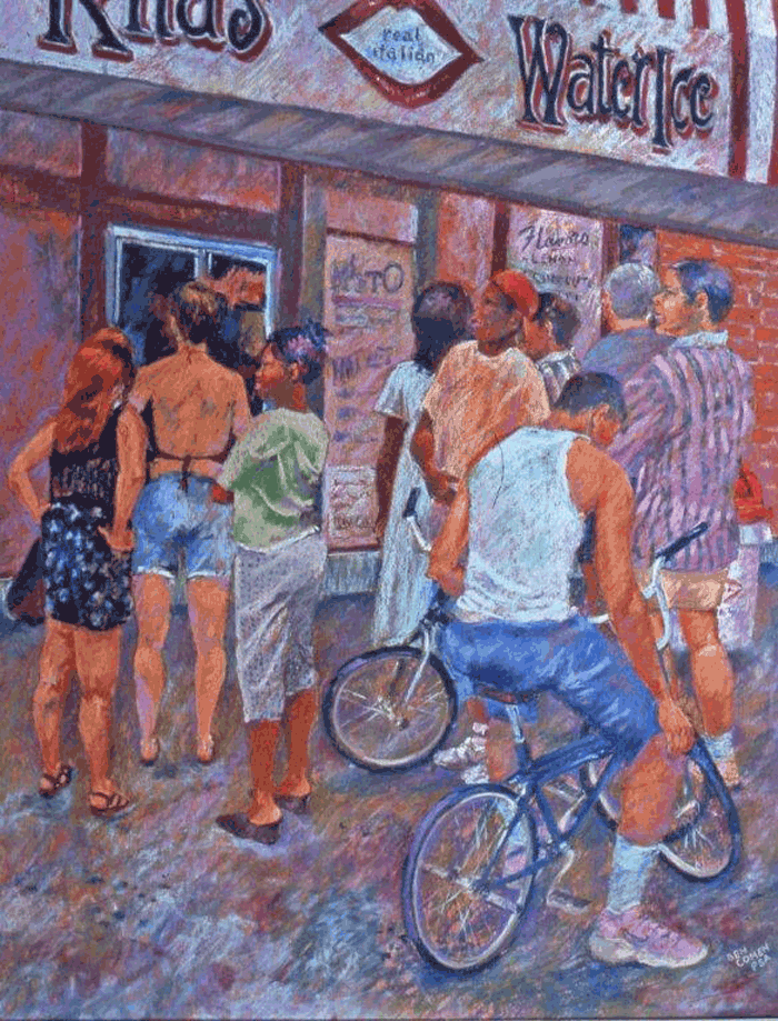
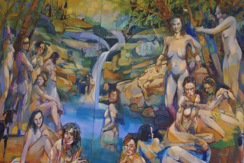
We are compelled to imagine a time when architectural spaces and objects were new representations of manufacturing, design, and aesthetic tastes and trends. The urban / suburban motifs have time and again provided artists with the perfect vehicle in which to explore universal topics such as: the complexity of infrastructure, commerce, demographics, and identity as inspiration to create new work. In this exhibition the participating artists imbue architectural structures and domestic objects with interpretations of historical experiences, social customs, and emotional memories as a cultural narrative. Artists include Philadelphia based artists: Lewis Colburn, Ben Grasso, Kay Healy, Erin Murray, and Miriam Singer. Chicago based artist Ann Toebbe, and New York based artist Brian Tolle. A work by Louise Bourgeois is included courtesy of the gallery permanent collection.

The catalyst behind the framing of this exhibition concept was the print Femme Maison, 1984, by Louise Bourgeois from the gallery collection. Femme Maison, which means both “woman-house” and “house-wife,” is one of Louise Bourgeois’s most famous motifs. For the artist, who was raised in France, the home was closely connected to female identity. By combining residential architecture and the curvaceous female body, Bourgeois portrays a woman who is obscured and entrapped by the domestic realm that she simultaneously supports.

The selected artists for this exhibition approach domesticity, architecture, and everyday objects from singular and accumulative perspectives. Brian Tolle creates a cross-wiring of reality and fiction in his sculptures and installations and blurs the border between the contemporary and historical with recurring themes of architecture, site, and technology. Lewis Colburn, of Philadelphia, sees objects as unreliable tour guides. He investigates ways in which we re-interpret and re-tell the past through the filter of our current experience. Ben Grasso, of Brooklyn, NY, presents a re-imagining of what actually exists and recasts these things in new terms creating a re-alignment of logic that makes plastic the anxiety underlying objects in the world through his painting. Miriam Singer, looks perceptually at multiple locations in Philadelphia and expresses the fragmentation of a fictional city as a collage of noise, pattern, and density.

By recounting memories of unique, collective, or habitual memories these artists investigate identity and history through interior and exterior experiences. Kay Healy, a Philadelphia based artist, creates large-scale screen printed and stuffed fabric furniture based on other people’s descriptions of their childhood homes and investigates how we relate to objects and cope with the fact that there is no way to truly return home. Ann Toebbe, a Chicago based artist, creates meticulous paintings using reconstructed memory and multiple perspectives to depict domestic and architectural spaces in cut-out paper doll fashion. Erin Murray, of Philadelphia, relates to buildings and built forms as being understood to represent our physical body, our cultural history, our economic reality, and our long-formed habits.

Brian Tolle, from New York, offers a lecture on February 25. He has completed several public art installations in New York, including the Irish Hunger Memorial in New York City. He has exhibited around the world and his work is included in numerous museum collections. He holds a B.A. in Political Science from SUNY at Albany; a B.F.A. from Parsons the New School for Design, NY; and an M.F.A. from Yale University in New Haven, CT.

The lecture will be presented at Westby Hall Room 111 beginning at 5:00 p.m. A reception follows at 301 High Street in Glassboro at 6:00 p.m.

Shuttle vans will be provided for guests traveling from Westby Hall to High Street. Return service will not be provided, but High Street is only a 15-minute walk away. Free public parking is available on High Street and neighboring streets. Municipal parking areas are available off Lake Street (behind Little Beefs Deli) and near the Barnes and Noble shopping complex between New Street and Rowan Blvd.

In/Dwelling: Meditations on Built Environments as Cultural Narrative
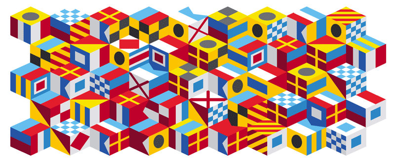
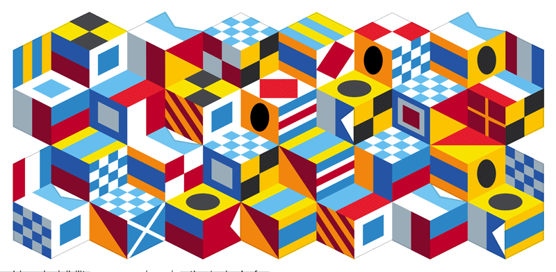
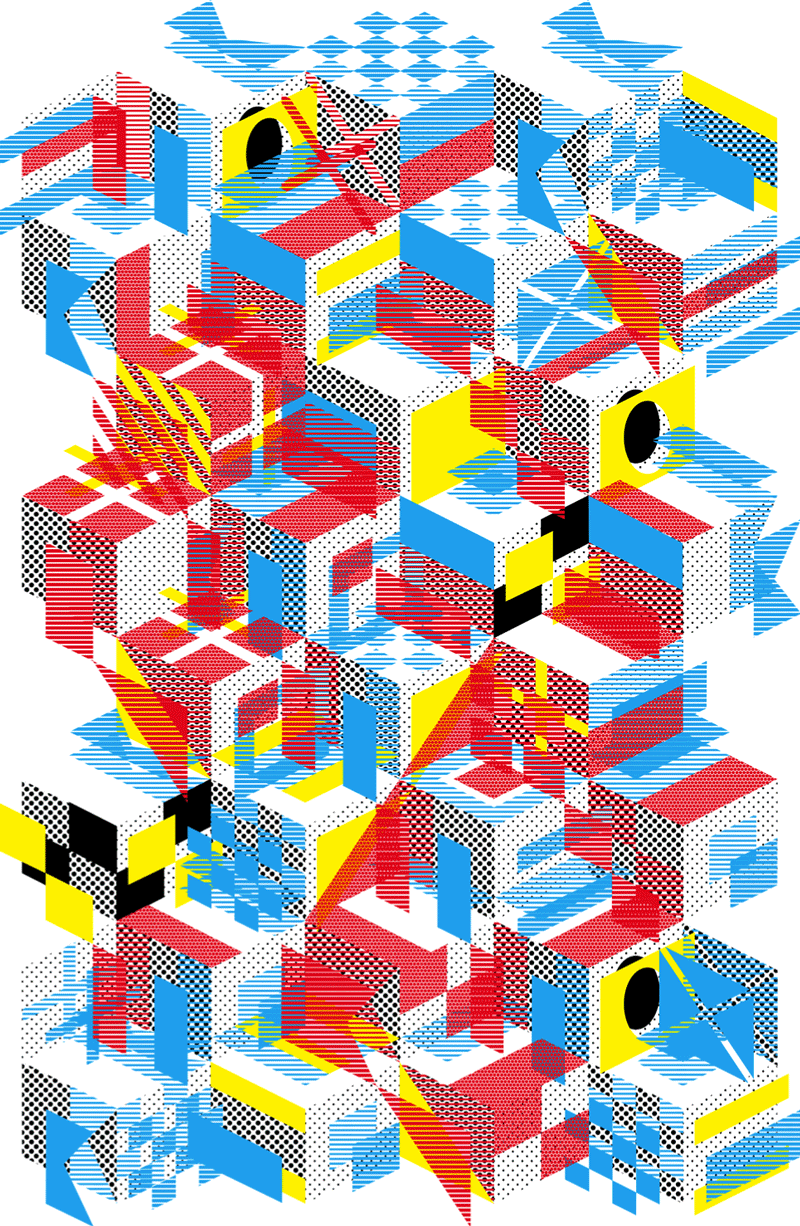
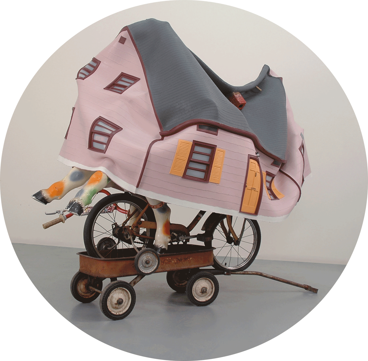
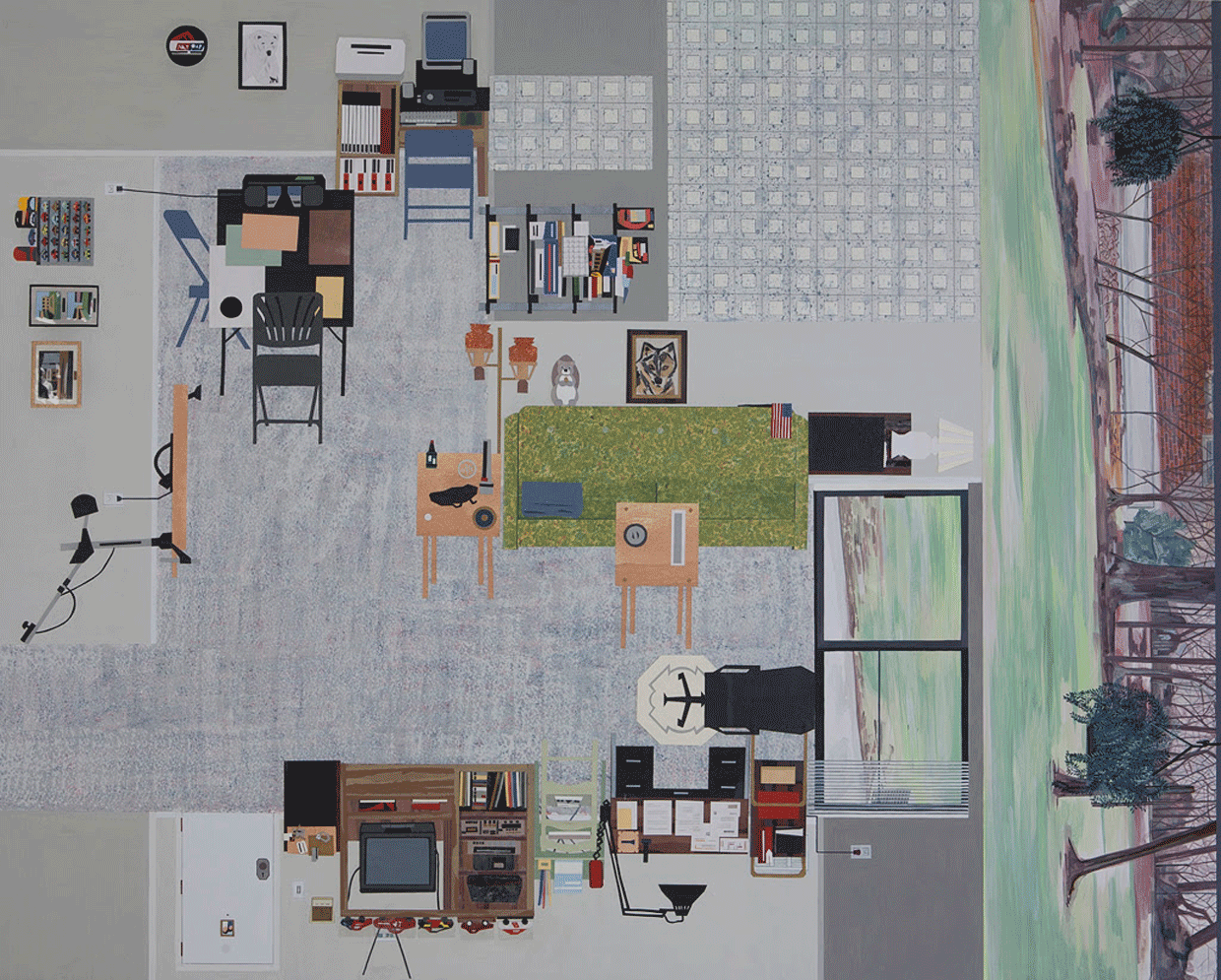
Images: top, Brian Tolle, Outgrown, platinum silicon rubber, toys. Courtesy the artist and CRG gallery. Bottom: Ann Toebbe, Jim’s Apartment, paper, gouache and pencil on panel.

Thank you to Rowan University Art Gallery for the content of this post.

Like DoNArTNeWs Philadelphia Art News Blog on facebook

Follow the new DoNArTNeWs.com

Follow DoN on Twitter @DoNNieBeat58

DoNArTNeWs on Tumblr

DoN Brewer on Pinterest

@donniebeat on Instagram

Affiliate Marketing [disclosure page] Shop on-line and help support DoNArTNeWs

Donate via safe and secure PayPal in the sidebar.

Studio

Bruce Garrity, Studio VisitBruce Garrity, Studio Visit, Rutgers-Camden, Recent Work, detail of large painting, photograph by Jeff Stroud

Bruce Garrity, Studio Visit, Rutgers-Camden, Recent Work

“I am really into architectonic, geometric abstract art like Sangram Mujamdar. He’s a really good painter, he’s Indian, American, teaches at MICA, you would probably like his work. I don’t know that I’m influenced by him but he’s somebody who is a contemporary, and I think my work somehow relates to his and what he’s doing. it’s also that they are representational that I like about them. There’s a few people around like that, Gideon Bok in Boston, they are more about perception.”

bruce5Bruce Garrity, Studio Visit, Rutgers-Camden, Recent Work, photograph by Jeff Stroud

The studio on the Rutgers campus has high ceilings, big widows, rolling lockers and space to paint big. Bruce Garrity‘s paintings are big, really big. So big that when he show’s them he has to rent a moving van. But the flexible space isn’t crowded and I didn’t notice any paint smell so I guessed the vivid paintings were acrylic.

“No, these are all oil paintings. We don’t use very much turpentine and usually what you smell is turpentine, I don’t use it very much. There are some passages that are sort of washy, but they were painted a while ago. I don’t use a lot of medium, I use a little bit of this alkyd because I need them to dry. But normally, I don’t even put any of that into it, it’s the oil paint, it’s thick, but it’s just the paint.”

I like using Liquin, but it smells. It’s good for outdoors but my studio smells like fumes.

“I just use a little and then the smell goes away after a day or two. In here it’s gotten to the point where we don’t use that much. My students have one can that they all wash their brushes in and that’s about it. We go though maybe a quart of turpentine per semester.”

I’ve been using Gamsol to clean my brushes.

“Some people say that’s a problem because you just don’t smell it, there’s still fumes in the air. There’s a school of thought that it’s better if it smells a little bit because then you’re aware of it in the air. We use a little of it so there’s not a lot of it in the air.”

bruce4Bruce Garrity, Studio Visit, Rutgers-Camden, Recent Work, photograph by Jeff Stroud

Bruce, you’re canvasses are huge, I struggle with just small ones.

“You know, it’s the scale. The scale that I’m comfortable with is essentially life-size at the picture plane. So, if I make a figure, the whole figure is six feet tall. So, it really has to do with the scale more than anything else. I like big paintings, too. But they’re a pain in the ass. You have to have to right space for them. But, you know, it’s how I like to paint. It is what it is.

That big one out there, the one that’s in the other room. That was a completely different painting in 1995. I showed it down here in the Stedman Gallery and it had a big dinosaur, and a jeep, and a bunch of other things. It was sort of like a museum/circus vibe, I was big into that back in the 90s. I kept it, because obviously no one was going to buy it. So at one point I just white-washed the whole thing.

Towards the end of the time that I was in graduate school that’s when I started to paint landscapes. I painted pretty heavily because I was in graduate school and I started do this waterfall bit that is kind of like what I would see up in the Poconos when we went on vacation. And then I started putting these figures in, kind of like Cezanne’s Large Bathers, it’s kind of like the Large Bathers of the Poconos.”

bruce3Bruce Garrity, Studio Visit, Rutgers-Camden, Recent Work, photograph by Jeff Stroud

Do you have people model for you?

“Some of them are. Either from models who were here. some are taken from drawings, photographs, a bunch of different stuff. Some are the top half might be one person and the bottom half might be someone else. They’re kind of Frankenstein-ed together, I don’t know that I would normally do that, but, that is basically how Cezanne did his. For a guy who was basically known as a perceptual painter, always painting what was in front of him, all the Bathers paintings, he made tons of them, were all from out of his head or old sketches. I think he even did some of them out of fashion magazines that his sister had. So, he was imagining girls with their clothes off, I guess.

Apparently, he was like nervous around models. It wasn’t like he never had nude models, but they made him nervous-er. I always thought that was really interesting, and everybody I always talks about the stuff that he did, looking at it perceptually, but going forward, the Cubists looked at those paintings and that’s where they got permission to do what they did. It was like, ‘He can do it. Why can’t we?'”

bruce2Bruce Garrity, Studio Visit, Rutgers-Camden, Recent Work, photograph by Jeff Stroud

Will you be showing this at your show at 3rd Street Gallery?

“Oh, yeah. It will probably be about twenty paintings. There are seven or eight big things, and a bunch of little things. We will be showing in the annex as well and there are some spots the smaller pieces will look well. I’m showing with Katherine Kurtz, she does some abstract things, some are more figurative. I would say she’s mainly an abstract painter but here she’s showing more figurative, DeKooning-ish, kind of figurative things.

The pairings at 3rd Street Gallery are kind of random, but sometimes you get these connections that are interesting. I’m looking forward to it, I like Katherine a lot. I like her work. And my work doesn’t always play well with others, they’re overwhelming and colorful and big. But I think our things are going to look good together.”

bruce6Bruce Garrity, Studio Visit, Rutgers-Camden, Recent Work, photograph by Jeff Stroud

Recent Work Bruce Garrity

September 2 – September 27, 2015

FIRST FRIDAY: September 4, 2015, 5:00 – 9:00 pm

ARTIST RECEPTION: Sunday, September 13, 2015,1:00 – 4:00 pm

Bruce Garritys poetic figurative paintings utilize a broad vocabulary of painterly means in the pursuit of visual drama. The surfaces of the works range from light washes, direct drawing, scumbles and layerings to heavy impastos of the mostly saturated color palette. Garrity draws on various methods of construction, to bring the works to fruition: direct perception, memory, invention and combinations of these. The paintings, some as large as eight by ten feet, depict figures and objects life size at the picture plane so one feels they can be entered and engaged directly. They are autobiographical of interests over a long period of time.”

The artist will present a walk through gallery talk on Sunday, September 20th beginning at 2pm.” 3rd Street Gallery

Written by DoN Brewer except where noted.

Photographed by Jeff Stroud

Like 3rd Street Gallery on facebook

Like DoNArTNeWs Philadelphia Art News Blog on facebook

Follow the new DoNArTNeWs.com

Follow DoN on Twitter @DoNNieBeat58

DoNArTNeWs on Tumblr

DoN Brewer on Pinterest

@donniebeat on Instagram

Affiliate Marketing [disclosure page] Shop on-line and help support DoNArTNeWs

Donate via safe and secure PayPal in the sidebar.

Church St.

 Church St. Art & CraftBen CohenChurch St. Art and Craft, photograph by Jeff Stroud

Church St. Art and Craft, 2nd Annual Summer Juried Art Show, Mt. Holly

Written and photographed by Jeff Stroud

In Mill Race Village, Mt Holly’s Historic area just off Main Street, sits a small two story house on the corner of Church Street. In two rooms of that historic house will be found a monthly collection of local artist work with the co-op member artist the basis of each of the collections. The Church St. Art and Craft space may be small yet it allows one to be intimate with the art, close enough to touch and intimate enough to imagine pieces in your own home.

The exhibition during the month of July is a juried show of member and guest artists who have submitted their work to be juried by Shaun Stipick; Director of the Herman T. Costello Lyceum, Burlington City, NJ. Mr. Stipick’s vision was held upon several oil paintings, watercolors, pastels, mixed medium collage, and upcycled paintings. Nineteen artists competed for wall space and prizes; most of the artists have at least 3 pieces exhibited among this collection.

churchst4 
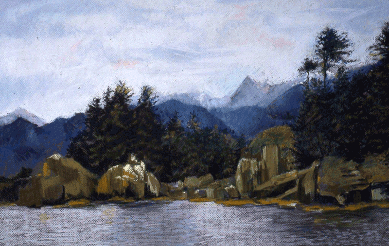
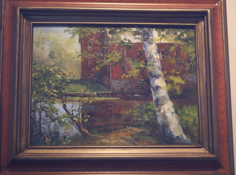
Judy Sawicki, Still Waters, oil, Church St. Art and Craft, photograph by Jeff Stroud

Third place winner is Judy Sawicki, a guest artist, with her small oil painting. ‘Still Waters’ graces the front wall, her work is classic nature scenes capturing the essence of old masters. Second place, a guest artist as well, is Joyce McAfee’s ephemeral watercolor ‘The Dune’; the painting seems to be a mirage, ready to blow away with the next wind.

churchst3
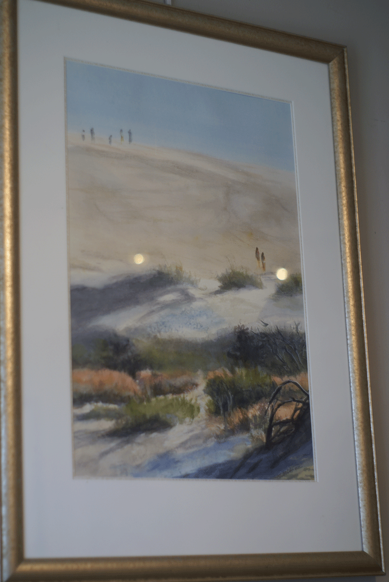
Joyce McAfee,The Dune, watercolor, Church St. Art and Craft, photograph by Jeff Stroud

churchst5
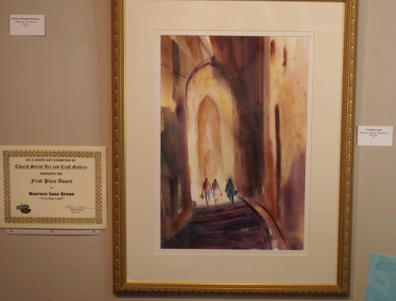
Maureen Gass-Brown, Traveling Light, pastel water colors, Church St. Art and Craft, photograph by Jeff Stroud

In first place is Maureen Gass-Brown’s ‘Traveling Light’ her pastel water colors seem to capture a sense of journeying to the path paradise. Maureen’s artistry brings nature and landscape to life offering muted color brilliance to her work.

The gallery exhibition is a feast for the eyes and soul, as you travel around the room you are greeted with humor, classic scenery, walks in a garden or on a beach, Ben Cohen’s brilliant primary color pastel flash out in bold reds, yellows, blues capturing city life in a bright flash, playful and humorous.

churchst1Church St. Art and Craft, through August 2nd, Summer Juried Art Showphotograph by Jeff Stroud

Written and photographed by Jeff Stroud

Like Church St. Art & Craft on facebook

Like Jeff Stroud – Nature Spirit Photography on facebook

Follow @jstroud52 on Twitter

Red Bubble: Jeff Stroud – Nature Spirit Photography

Like DoNArTNeWs Philadelphia Art News Blog on facebook

Follow the new DoNArTNeWs.com

Follow DoN on Twitter @DoNNieBeat58

DoNArTNeWs on Tumblr – check Tumblr for hi-res versions of the photographs in this post

DoN Brewer on Pinterest

@donniebeat on Instagram

Affiliate Marketing [disclosure page] Shop on-line and help support DoNArTNeWs

Donate via safe and secure PayPal in the sidebar.

Inspired

Inspired By, Ben Cohen, Church St. Art & Craft

Inspired by, Ben Cohen, Church St. Art & Craft

Inspired by, Ben Cohen, Church St. Art & Craftshowing Faces, Figures, City/Landscapes, June 3rd – June 28th, 2015. Reception, Saturday June 6th, 6:00 – 8:00pm. Church St. Art & Craftformerly Home Fine Art Gallery, 2 Church St. (at White St.), Mt. Holly, NJ 609-261-8634

“This show is an eye opener for me. At 92, it taught me I can still learn from 5 year olds with no art training.” – Ben Cohen

Inspired By, Ben Cohen, Church St. Art & CraftInspired by, Ben Cohen, Church St. Art & Craft

“I am “Inspired” by the spontaneous line, uninhibited brilliant color, fearless use of form, and the very direct self expression exhibited by our very young self taught artists – I have learned a great deal from their work. – Ben Cohen

ben9Inspired by, Ben Cohen, AlaskaChurch St. Art & Craft

“My paintings range from expressive realism to semi-abstract;
and I work in pastel, gouache and transparent watercolor.”

ben8Inspired by, Ben Cohen, Water IceChurch St. Art & Craft

“I try to make the viewer “wake up” to life as we know it. I do this by the use of ordinary subject matter and hopefully an exciting handling of color, content and format. I want to give my message in a direct easy-to-understand manner.”

ben7Inspired by, Ben Cohen, Sunlit SilosChurch St. Art & Craft

“I look for the something in areas and situations thought of as “nothingness”, and I invite the viewer to participate in these situations. Sometimes I do people with scenes and sometimes scenes with people. For the most part I feel that much of the so-called nothingness can be uplifting and thought-provoking.”

ben5Inspired by, Ben Cohen, Gordan, pastel, Church St. Art & Craft

“I feel the artist must continue to grow and convey a message.”

ben4Inspired by, Ben Cohen, FarmsteadChurch St. Art & CraftInspired By, Ben Cohen, Church St. Art & CraftInspired by, Ben CohenChurch St. Art & Craft, Blue Skies

Church St. Art & Craft is an eclectic art space. We are a cooperative art gallery in the historic Mill Race Village in Mt. Holly, NJ. We are a custom frame shop, a place to gather and create art and a shop to purchase charming hand made gifts. In short, a wonderfully creative place to visit!

Thank you to Ben Cohen and Church St. Art & Craft for the content of this post.

Like Church St. Art & Craft on facebook

Like DoNArTNeWs Philadelphia Art News Blog on facebook

Follow the new DoNArTNeWs.com

Follow DoN on Twitter @DoNNieBeat58

DoNArTNeWs on Tumblr

DoN Brewer on Pinterest

@donniebeat on Instagram

Affiliate Marketing [disclosure page] Shop on-line and help support DoNArTNeWs

Donate via safe and secure PayPal in the sidebar.

COLOR

CHROMOGRAPHY: WRITING IN COLOR, Rowan University Art GalleryMelinda Steffy and Gerard Brown, Sketch for The Hours, 2014, colored pencil on paper.

The Text for Translation

Written by Jane Irish

“The task of the translator consists in finding that intended effect upon the language into which he is translating which produces the echo of the original.”—Walter Benjamin, The Task of the Translator, 1923 (translated by Harry Zohn)

Prelude:

I am an artist writing this essay. In my work, I try to practice openness, to travel eagerly through territories of another’s culture. By painting about Vietnam, France, and the United States resistance histories, I practice to rectify the problem with European-based training of art history and history in general. Looking at Brown and Steffy’s work takes me to some stories that I often repeat. They are my core experiences with translation.

I. Counterpoint

In 2008, I traveled for my first time to Vietnam. I was inspired by John Balaban’s Remembering Heaven’s Face and reading his poetry and his translations of Ca Dao Vietnamase folk poetry. Just after, I saw him speak in Philadelphia. He was in his 60s. Some people are connectors, and John is one of these. He is highly thought of, a sage, someone who has stuck with his subject matter.

I have looked up to him. In 1994, nearly 15 years before meeting John, Linh Dinh was another person I looked up to. He was a young poet and painter living in Philadelphia; he was rough-talking and tough on his feet. I had him to my studio long before I started on a Vietnam narrative. He liked my paintings that day in my studio; he thought I had moxie.

CHROMOGRAPHY: WRITING IN COLOR, Rowan University Art GalleryMelinda Steffy, Prelude in C Major (red), No. 1, 2013, watercolor on paper, based on music by J.S. Bach.

Both of these idols of mine went on to translate the poems of Vietnam’s favorite poet, Hồ Xuân Hương. John was a conscientious objector during the Vietnam War but served in Vietnam with the Friends International Volunteer Services, first as a teacher, then saving burned children. Linh Dinh was born in Saigon in 1963 and in 1975 came to the U.S.

In 2010, I was visiting John Balaban in North Carolina. I had come to learn from the sage and to deliver a gift to him—a vase I had made with the collected Ca Dao poetry. When I arrived he was wearing a heart monitor, as he was in the midst of tests for a serious heart condition. I spent the evening learning about his days studying Mekong folk culture, his continued alliances with activists, and about Hồ Xuân Hương. The next morning, I learned how utterly emotional

the competition can become between translators. I mentioned Linh Dinh at the kitchen table and John flew into rage, heart monitor bleeping. They were both in the midst of working on the translating the same 18th century Vietnamese poetess. Returning home, I saw on many literature blogs that an ongoing insult fest was in high gear.

CHROMOGRAPHY: WRITING IN COLOR, Rowan University Art GalleryMelinda SteffyParallel Motion, No. 11, 2014, based on music by Béla Bartók.

II. Dissonance

There are three artists I visit in Hue, Vietnam: two twins (the Le Brothers, born in 1975 in Bình Trị Thiên) and one printmaker. They pick me up or have a student pick me up, and I ride on the back of a motorbike to a curatorial camp for a discussion of communist post modernism on a reclaimed French plantation. Or they send me on a boat trip up the Perfume River with a calligrapher and his family (wife, brother with Agent Orange disfigurement, father, grandfather, and student). In 2012, artist Phan Hai Bang invited me to work in his printmaking and bamboo papermaking studio in Hue, Vietnam. This was my third trip. On the first I had mused on finding motifs in dissident Vietnam Veterans’ literature. Then I traveled the poetry of Hồ Xuân Hương. Now I was intent on replacing right-wing myths with nuances. I was into serious iconography, combining images of monks and anti- war veterans, signifying a combination of spirituality and post traumatic stress disorder. The young artists working with Phan and me said, “You are killing he said, “a score!” His closest aesthetic hero/col-the monks,” which they found very funny.

III. Notation, with alertness after speaking with Gerard Brown and Melinda Steffy David Stearns and I were to go to the orchestra. He is a classical music critic. That evening we met for dinner, and later quickly stepped into his apartment so he could retrieve a Brahms score. His parlor had dim light, lots of upholstery and lamps, very French bohemian. As my eyes adjusted, what appeared to be floor-to-ceiling bookcases on three walls of the room became a multicolored grid of a smaller scale, made of thousands of CDs of classical music. I still want to paint that room.

David grabbed a large folio of sheet music from the back room and we walked to the Kimmel Center. In the dark of the theatre, he followed the large-scale score and wrote notes on his playbill. Soon after, David told me, “the score, it’s a blueprint.”Just now, I chat with my office neighbor at Penn, Bill Whitaker at the Architectural Archives. I asked him what a blueprint was, and no backstory given,he said, “a score!” His closest aesthetic hero/colleague, the landscape architect Lawrence Halprin, was solid on this idea—that a blueprint was time-based. “One doesn’t see a building or a garden like a photograph,” Bill said, “the architect’s blue drawing tells us the process by traveling through it.”

Coda: In visual art, knowing the backstory isn’t really necessary, it is more important to be completely present. But Brown and Steffy’s work embody a process supporting our journey; we can see how conceptualism is a way to travel through painting.

Jane Irish. A self-described history painter, Jane Irish has been making work on the theme of heroic resistance movements since 1998, building on her interest in using art to explore the concepts of social class and political art. She has exhibited her work in NewYork and Philadelphia since 1983. The recipient of many awards and fellowships, she received her BFA from the Maryland Institute College of Art and her MFA from Queens College, CUNY.

CHROMOGRAPHY: WRITING IN COLOR, Rowan University Art GalleryGerard Brown, After Edith Wharton (In reality they all lived in a kind of hieroglyphic world…), 2015, Digital print on Dibond.

About the Exhibition

‘Chromography’ examines the relationship between graphic communication and sound. Writing is an ancient and elegant system of recording the human voice, and it has spawned other systems for the notation of music and movement. Most of these systems are so successful they seem to achieve invisibility – we can imagine the ‘voice’ of the writer when we read a page, or ‘hear’ the music described in a score. The system of representation disappears into the thing being represented. The authority of these systems is unchallenged; it rests on communicating their messages ‘in black and white’.

CHROMOGRAPHY: WRITING IN COLOR, Rowan University Art GalleryGerard Brown, After Robert Smithson (Language should find itself in the physical world…), 2015, Digital print on Dibond.

‘Chromography’ insists on a place for color in the description of sound and music. This complicates the relationship between seeing and reading because colors bring associations along with them. Are they bright or dull? Warm or cool? In sunshine or shade? What does it mean that a piece of music is composed mostly reds, oranges and yellows?

What do we see when the letters are switched with color symbols? Could such changes reveal patterns that tell us something new about communication? Translation scholar Lawrence Venuti argues that the translator’s invisibility results in important decisions being hidden from view. By pushing back against the conventions of writing and musical notation and exploring the space that such actions open, we hope to learn more about the content we represent.

CHROMOGRAPHY: WRITING IN COLOR, Rowan University Art GalleryGerard BrownAfter Judith Butler (An active and sensate democracy requires that we learn how to read well…), 2015, four screen prints on paper

About the Artists

Gerard Brown, a writer and painter, is an Assistant Professor at Temple University’s Tyler School of Art. His work explores how the mind moves from seeing to reading by concealing writing in patterns and color. His paintings and drawings have been exhibited at the Woodmere Art Museum, Tiger Strikes Asteroid, Painted Bride Art Center, Philadelphia Sculpture Gym, and the Icebox (all in Philadelphia), as well as Finlandia University Art Gallery (Michigan) and 5.4.7 Art Center (Kansas). He has also organized exhibits for the Center for Art in Wood (Philadelphia) and Hicks Art Center at Bucks County Community College.

Melinda Steffy, a visual artist and classically-trained musician from Philadelphia, has had artwork displayed across the Northeast and beyond, including the Icebox, the Hall at the Crane Arts Building, and Sam Quinn Gallery (Philadelphia); Delaware Center for Contemporary Art and Fringe Wilmington (Delaware); Lancaster Museum of Art and Villanova University (Pennsylvania); Finlandia University (Michigan); Micro Museum (New York); and Stamford Art Association (Connecticut). She is an artist member of InLiquid and a LEADERSHIP Philadelphia fellow. An accomplished musician, Steffy currently serves as Executive Director for the innovative music non-profit LiveConnections and sings with the Chestnut Street Singers.

This program is made possible in part with funds from the New Jersey State Council on the Arts. Additional funding was provided by The Vice Provost for the Arts Grant from Temple University, Philadelphia. Rowan University Art Gallery Westby Hall Rowan University call 856-256-4521 or visit www.rowan.edu/artgallery

Thank you Mary Salvante and Jane Irish for the content of this post on DoNArTNeWs

Mary Salvante is Curator, Gallery and Exhibitions Program Director Rowan University Art Gallery, 201 Mullica Hill Road, Westby Hall. Glassboro, NJ  08028
856.256.4521
salvante@rowan.edu

Rowan University Art Gallery is a premier cultural destination for the
Rowan University community and greater South Jersey region presenting the
work of professional contemporary artists.

Like Rowan University Art Gallery on facebook

@RowanUArtgallery on Twitter

Like DoNArTNeWs Philadelphia Art News Blog on facebook

Follow the new DoNArTNeWs.com

Follow DoN on Twitter @DoNNieBeat58

DoNArTNeWs on Tumblr

DoN Brewer on Pinterest

@donniebeat on Instagram

Affiliate Marketing [disclosure page] Shop on-line and help support DoNArTNeWs

Donate via safe and secure PayPal in the sidebar.